Case Study Goals
Rebrand and design a vertical and a horizontal PDQ packaging for the Bull’s Beef Sticks product. Create at least two unique brand identities.
Four PDQ Package Designs & Brands
Bulls Snack Sticks, a Monogram Foods subsidiary, are a run of the mill beef product sold generally in convenience and corner stores. The current branding blends right in along with all the other snack sticks lining the check out aisle, and this case study examines a number of design routes to give the Bull’s brand a breath of fresh air.
I used this case study as a challenge to take as many PDQ design ideas from concept to mockup in a three week period as I could, along with my other school workload. I was able to get five dielines/ brands completed and four mocked up, a feat I am very proud of. This was a great opportunity to use playful themes and motifs, fun typography, and use of characters/mascots. These PDQ packages aim to entice hungry or hangry customers to reach for the more happy looking box.
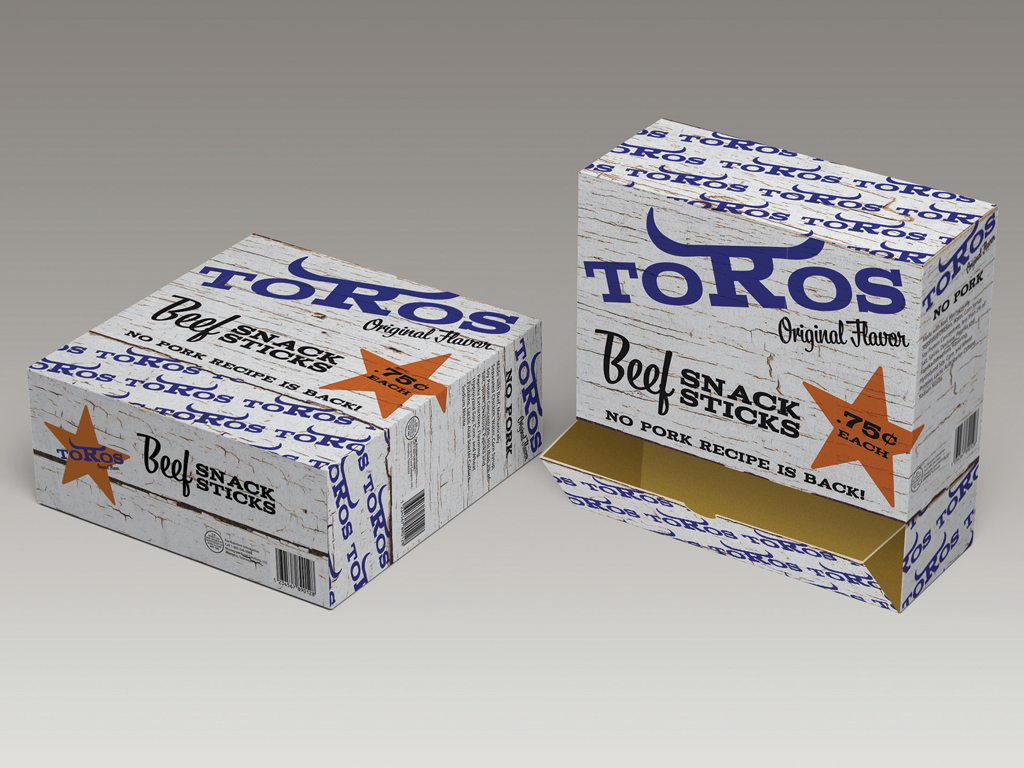
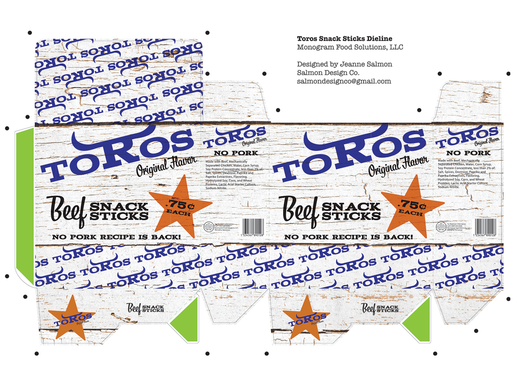
Rebrand No. 1: Toros
Giving the brand a new name and a new set of horns, this package design gives a nod to the cattle ranch aesthetic. Creating a repeating pattern using the new logo, this “wood clad” package draws the eye in an aisle rife with bull imagery and the colors red and yellow.
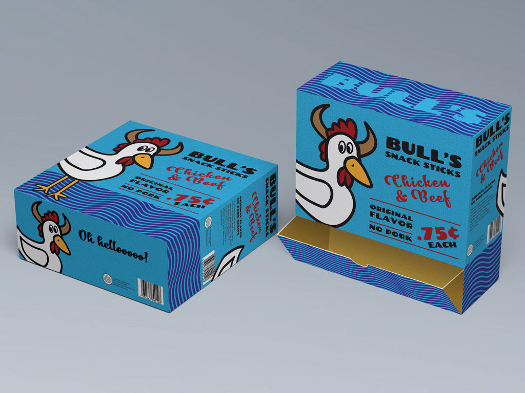
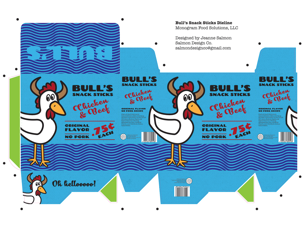
Rebrand No. 2: The Big Chicken
Playing on the chicken part of Bull’s beef and chicken recipe, this playful package design is marketed towards all genders, rather than the very male-dominated branding of competitors. A great mascot, the Big Chicken has endless potential for aisle violators, end caps, or freestanding PDQs.
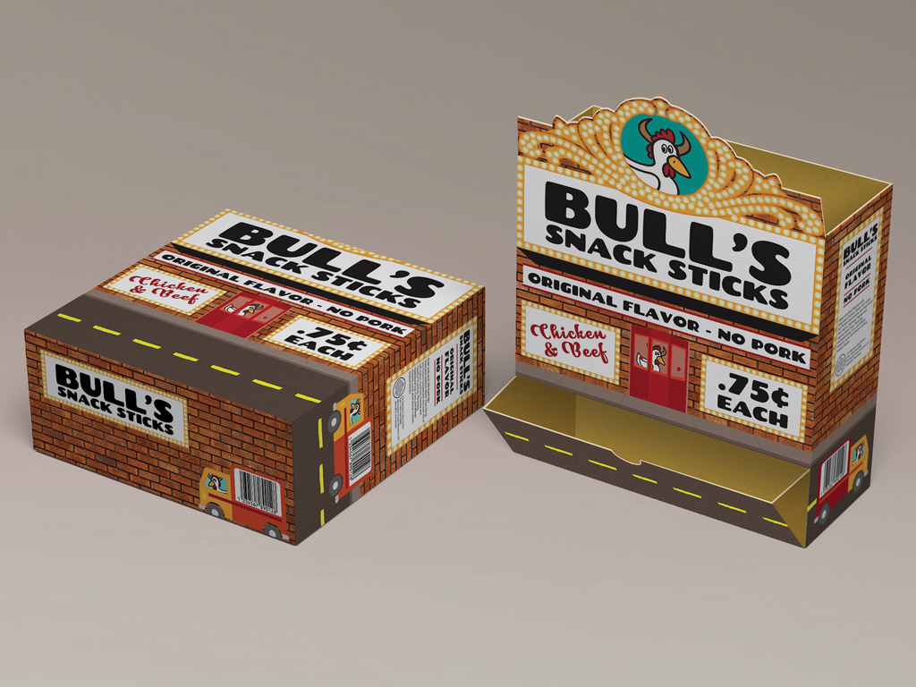
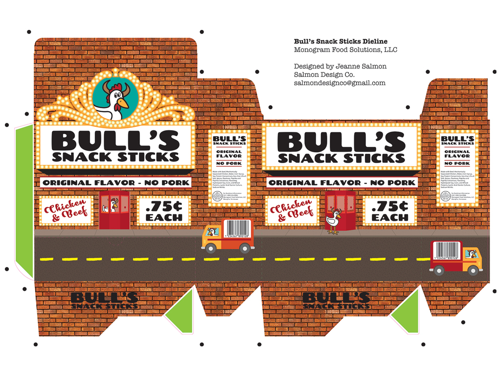
Rebrand No. 3: The Marquee
This design was a bonus, I wanted to play around with the Big Chicken character in a cheeky way. This package was designed to be sold specifically in cinemas, creating a little world in the form of a theater seemed perfectly fitting. A perforated top allows the marquee to pop up and stand tall above the countertop PDQ.
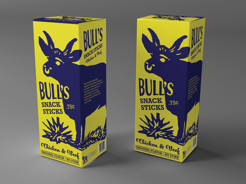
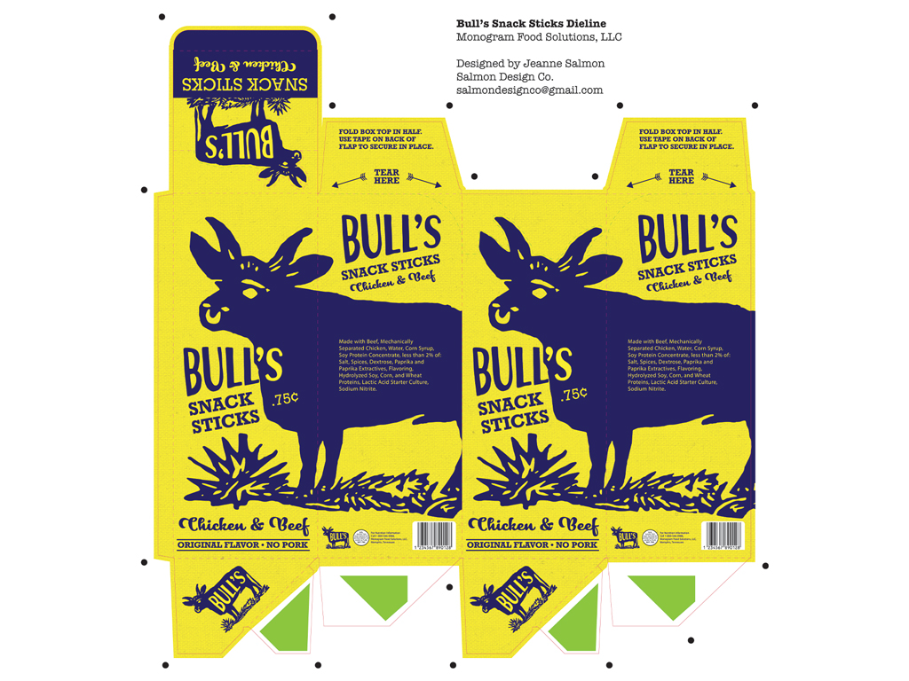
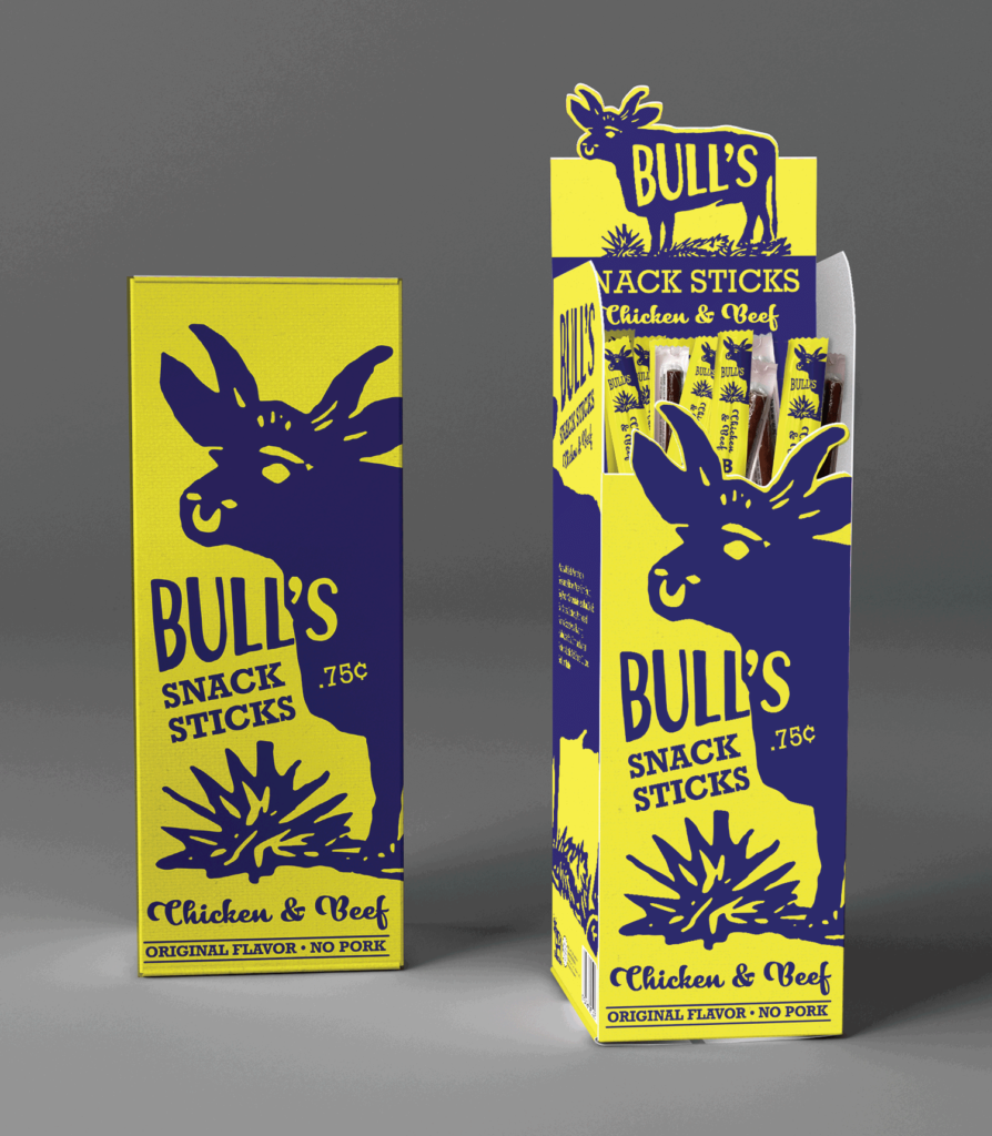
Rebrand No. 4: The Big Bull
This vintage bull image has been repurposed as an ornate logo, with the word “Bull’s” on the side. This PDQ package uses several perforated cuts and scores to allow the horns of the bull on the front panel to be exposed, and a pop up back with a perforated bull logo. Instructions for how to assemble the pop-up are printed on the box and torn away.